What is VIBO?
VIBO is an upscale Italian restaurant located in Toronto, Canada. It offers a romantic and cozy ambiance with stained glass windows, a grand piano, and a large wine cellar holding over 200 bottles. They have a diverse menu with a wide range of options to choose from. Some popular dishes include wood-fired pizzas with a variety of toppings, classic pasta dishes like spaghetti carbonara and lasagna, as well as fresh seafood options like grilled salmon and shrimp scampi. They also offer a selection of appetizers, salads, and desserts to complete your meal.
This restaurant is known for its two dining levels and is considered one of the best Italian restaurants in the Greater Toronto Area for a fancy night out. Reservations as well are highly recommended, especially for dinner, as it can get quite busy.
Objective
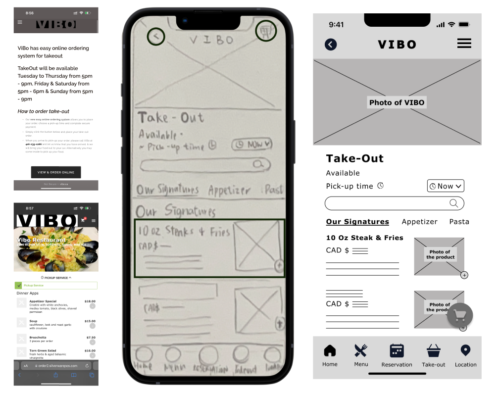
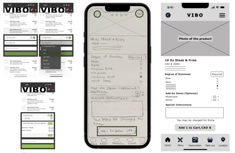
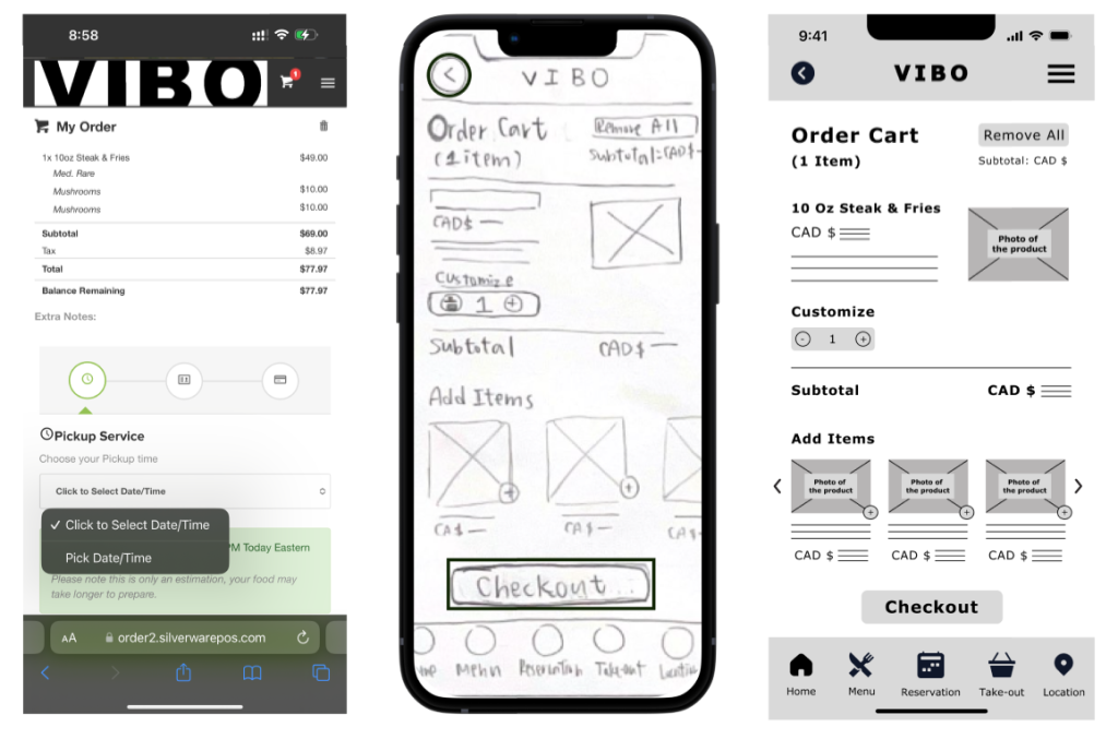
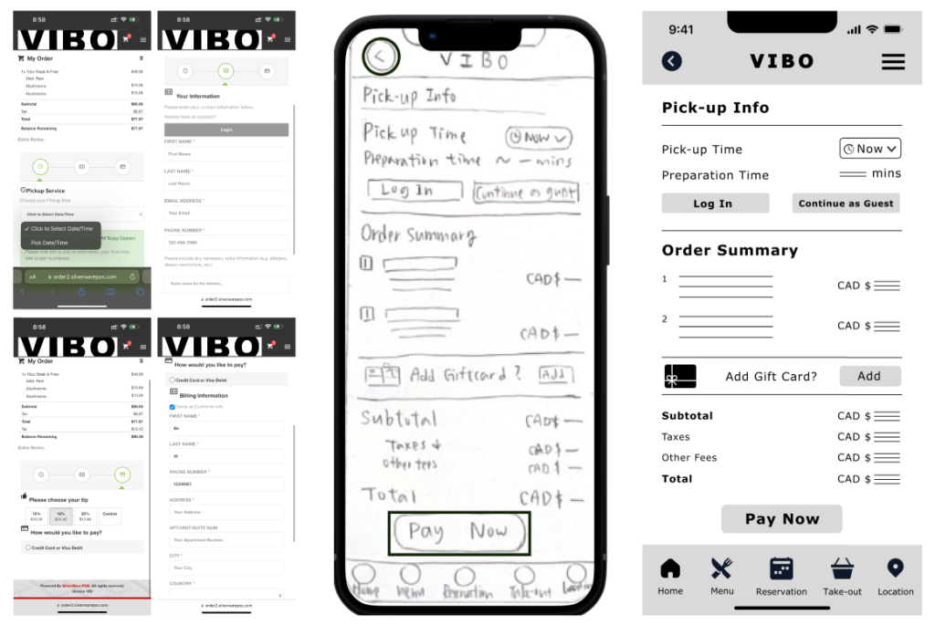
The primary goal is to redesign a specific path on the VIBO mobile website. The path chosen for this project is the TAKE-OUT ordering process. By redesigning the dedicated takeout path, I aim to streamline the user journey and create a more intuitive and seamless experience for customers who wish to order items for takeout. This initiative will not only improve user satisfaction but also encourage increased engagement and conversions within the takeout segment of the business.
The TAKE-OUT ordering path on the website was selected for optimization because other paths like reservation, menu browsing, private events, etc, are relatively straightforward. After thoroughly analyzing the mobile website, it became evident that the current take-out process involves unnecessary stages and pages that could potentially confuse users. By simplifying this path, I aim to provide a smoother and more intuitive experience for customers placing take-out orders.
Design guidelines
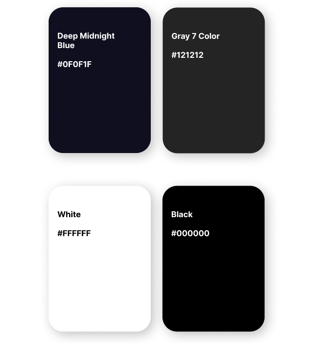
VIBO is an Italian restaurant that exudes a high-class and elegant ambiance; therefore, this color deep midnight blue has been selected to represent this elegance.
Deep Midnight Blue
#0F0F1F
Gray7 Color
#121212
White
#FFFFFF
Black
#000000
Typography (Font choice and typeface)
The original font type of the restaurant’s take-out page (Verdana) has been utilized for this design.
Verdana is a sans-serif font that is known for its clarity and readability, especially at smaller sizes. The font’s clean and balanced letterforms, offers excellent legibility on screens.
Mobile
Header 1
Font: Droid Sans / Font size: 16 / Style: Bold
Header 2
Font: Verdana / Font size: 12 / Style: Bold
Body
Font: Verdana / Font size: 8 / Style: Regular
Website
Header 1
Font: Verdana / Font size: 14 / Style: Bold
Header 2
Font: Verdana / Font size: 12 / Style: Bold
Body
Font: Verdana / Font size: 8 / Style: Regular
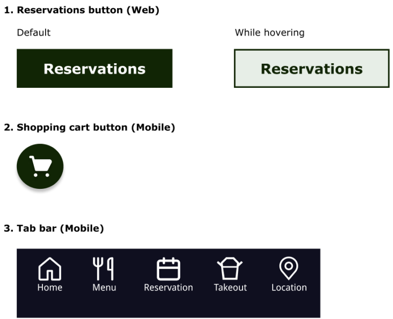
Buttons
Changes made (Original Page vs Paper Sketch vs Low-Fidelity)
Homepage
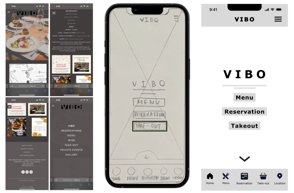
Take-out page
Item page
Cart page
Payment page
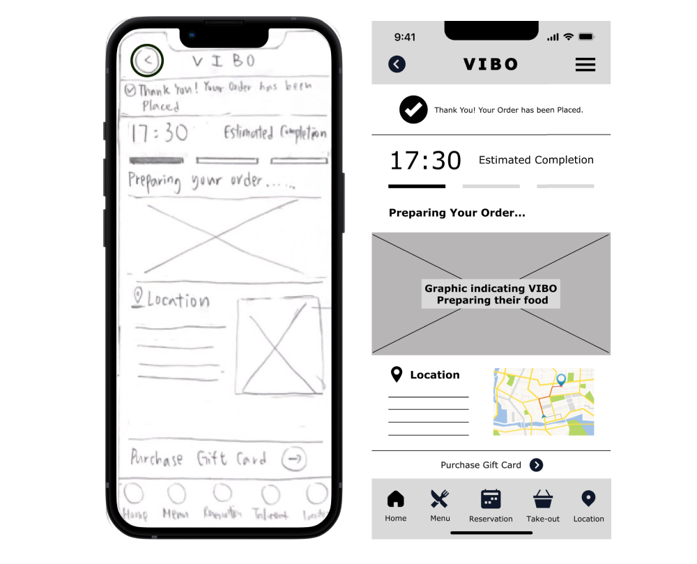
Confirmation page
