


Executive Summary
What did we do?
I and my team collaborated and conducted an examination of the purchase path, product discovery, filter interaction, and accessibility of the Zara website.
Findings: significant user challenges in finding products, reports of distraction, confusion, and frustration.
We Recommend
- Incorporating a clear product information hierarchy
- Clear and effective filtering options
- Non-distracting visual element
Impact
- Streamlined purchase experience for increased sales
- Enhanced user satisfaction for customer loyalty
- Reduced costs by reducing customer calls
Introduction
Background
We conducted a heuristic evaluation of the Zara website in the purchase path, finding products, interacting with filters, and accessibility.
Scope
Testing the efficiency, functionality, purchase flow, and accessibility of the Zara website.
Objectives
Make finding and purchasing items efficient and easy for users, improve the website’s accessibility


Methods
Heuristic evaluation
We assessed the website based on Nielsen’s 10 Usability Heuristics for User Interface Design.
Moderated virtual usability test
We asked participants to complete tasks while thinking aloud and walk us through their mental process. (N = 10)
Data collection
The data were recorded by recording on the virtual meeting platforms as well as the notetakers’ notes.
Participants
Demographics
10 participants
Age range: 19 – 70
Wide range of professional backgrounds: financial, academic, counselling, law, and undergraduate students.

Data Collection
Tools and instruments used
- Zoom, Microsoft Teams
- Google Docs, Google Drive
Process
The data were recorded by recording the virtual sessions and participants sharing their screen. The recordings were then sent to the notetakers to take notes. Notes were taken either by pen and paper or typed in Google Docs.
Data Collection
Success / Failure
We compiled the quotes based on the task, labelled them as failures or successes, and whether the tasks were completed or not.
Common Trends
We synthesized the findings and grouped them based on themes such as findability and navigation issues, visual clarity and layout issues, filtering issues.

Findings
Task 1:
Find the refund policy

Findings
Task 1:
Find the refund policy
Findability:
Initially, users were unable to find the return policy page. They noted that excessive images and animations obscured important buttons and content, hindering their exploration.
Complex Navigation
Users encountered confusion while navigating through. Due to how chaotic and “messy” it looked, users had no idea as to where to navigate through and locate the return policy page, making it look like they were on the wrong path.
Success
Fail
“When I look for the return policy I’d scroll down to the bottom, but I don’t think it’s here”
Inconsistent Product Information and Details:
Initially, users were unable to find the return policy page. They noted that excessive images and animations obscured important buttons and content, hindering their exploration.
Poor Information Architecture and Product Tagging:
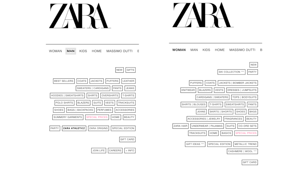
Users found the filtering options extremely limited and inefficient, only allowing size, color, and price filters, with no specific warmth level or style filters.
Distracting Flow:
As mentioned above, search results sometimes did not align with the search terms. This led to confusion, frustration, and wasted time.
Success
Fail
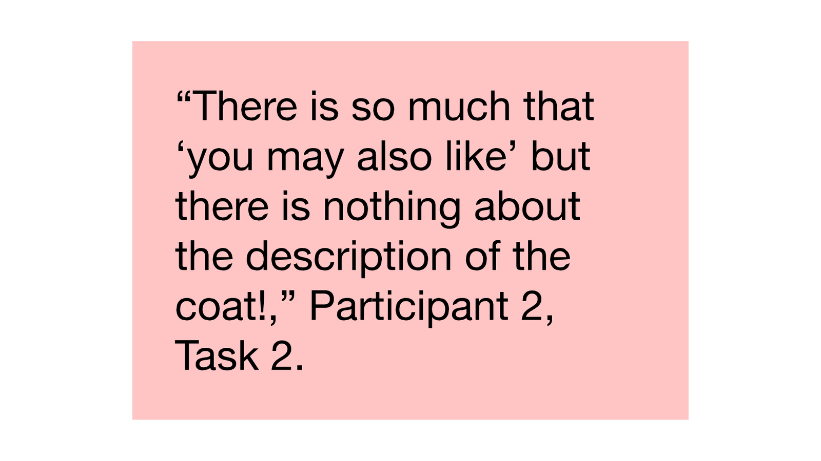
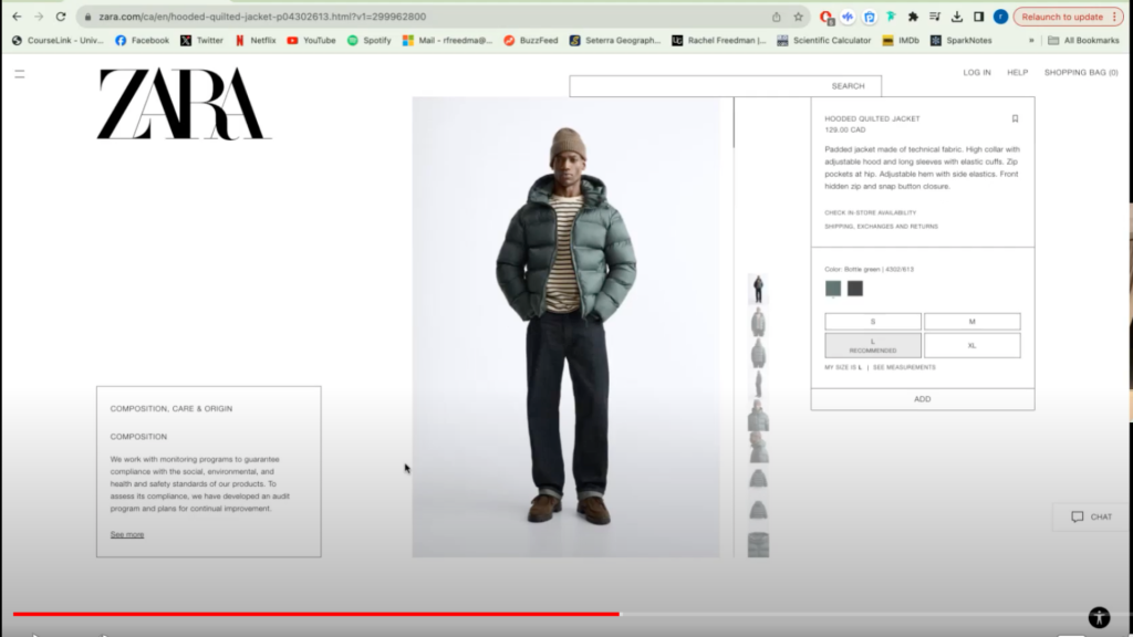
“There is so much that you may also like but there is nothing about the description of the coat!”
Findings
Task 2:
Find a coat/parka that you would wear and buy that would keep you warm in -20 C, make sure it fits, and add it to the cart.

Findings
Task 3:
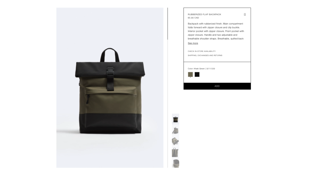
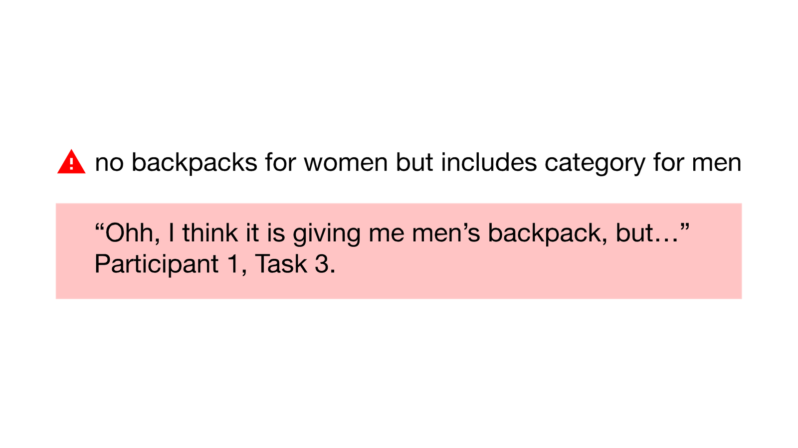
Find a backpack that would be suitable for school / work with a laptop sleeve.

Findings
Task 3:
Find a backpack that would be suitable for school / work with a laptop sleeve.
Navigation & Findability Issues:
Users had a challenge to find elements of the website, such as the search box on the home page. When they did, sometimes elements would disappear as well as reappear.
Filtering Issues:
Users found it hard to navigate the product page without using the required filters they needed. The few filters they had were utilized but were not much help.
Visual Clarity & Layout Issues:
Users distressed the lack of visual help during their task. Often commenting about hard text to read on the page and navigation, product pictures and their accuracy and the inconsistent layout of the page.
Success
Fail
“there are many backpacks but it’s a little difficult to understand which backpack has a laptop sleeve inside so I have to check randomly”
Visibility:
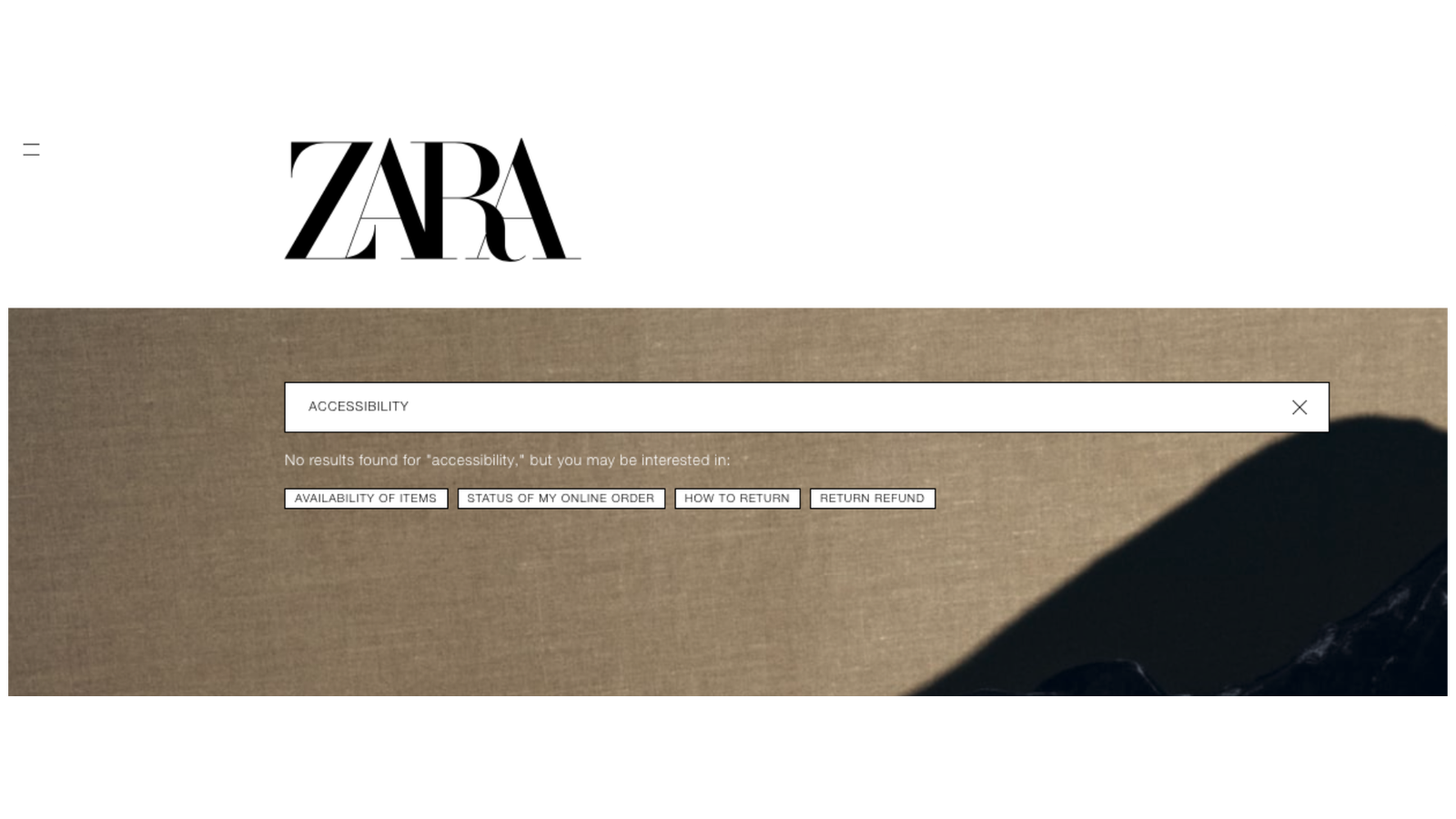
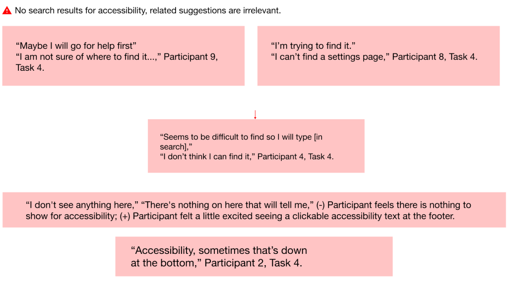
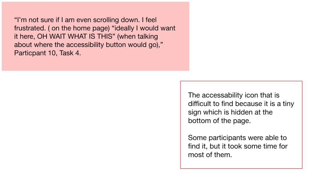
Participants could not locate the accessibility features on the website as they assumed it would be part of the menu, footer, or under Help.
Consistency:
Inconsistencies were observed by the participants such as the inability to find the accessibility settings in places they have found it on other sites.
Unfamiliar language:
When in the accessibility settings, participants felt confused between two similarly labeled screen reading tools, screen reader adjustment and text reader.
Success
Fail
“What is this little guy doing at the bottom corner?” (The participant found the accessibility icon in less than a minute). “That wasn’t obvious, but it appears there is an accessibility section there.”
Findings
Task 4:
Find the accessibility settings of the website and make it so that it reads off the screen.

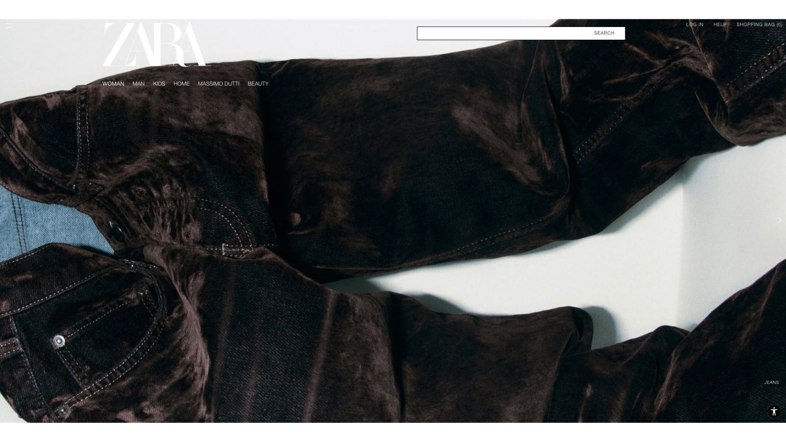
Findings: Distracting and Cluttered flow

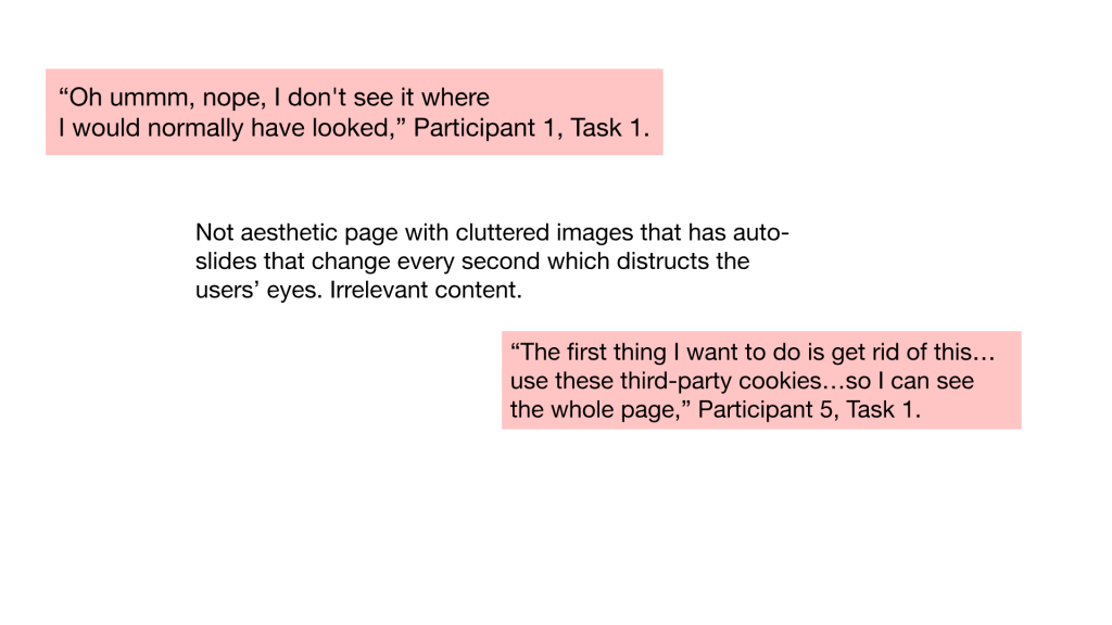
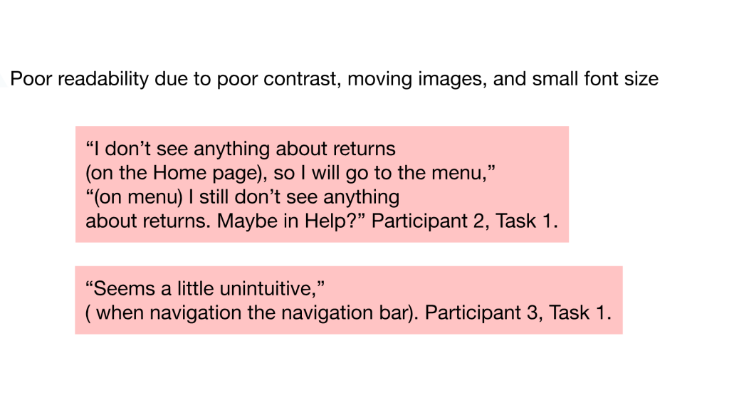
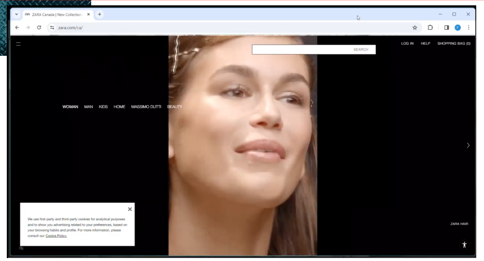
Findings: Distracting and Cluttered flow
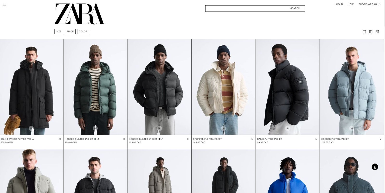
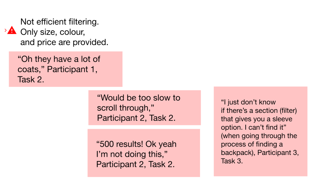
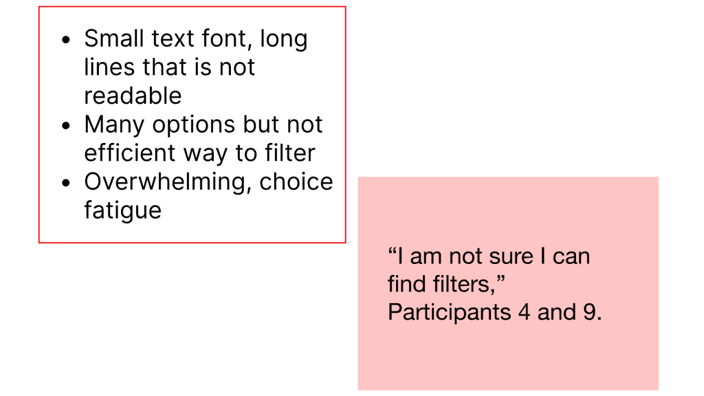
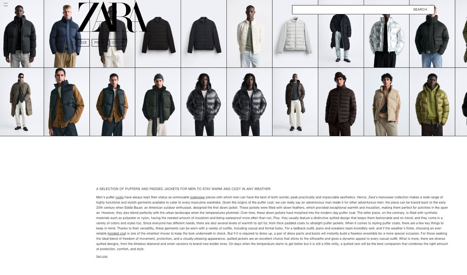
Findings: Distracting and Cluttered flow


Recommendations
Clarity, visibility, accessibility:
- Increase font sizes and bold important information such as the price
- Reduce visual clutter/minimize distractions such as videos and automatic carousels taking up the background.
- Clear labelling of the accessibility settings and making it findable under Help and search results.
Purchase path:
Clear and visible call-to-action buttons
(e.g., add to cart)
Navigation:
- Multi-level navigation menu and breadcrumbs to hierarchically organize information
- Provide comprehensive and efficient filtering and sorting options (fabric, features, warmth, waterproof, windproof, sort highest rated)
Product Information
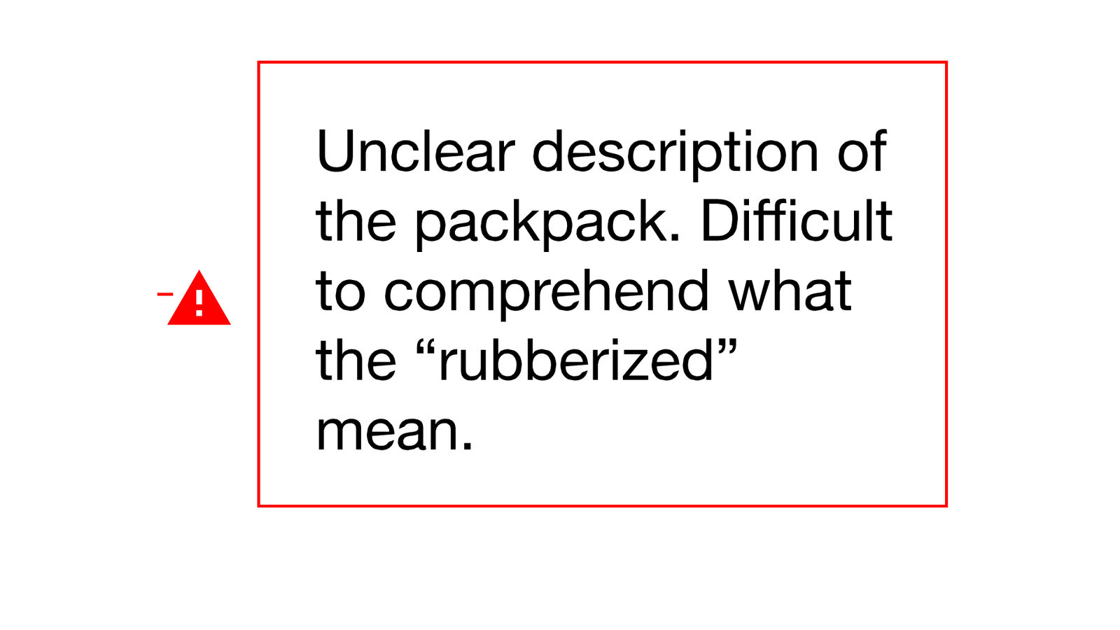
- Accurate and consistent product descriptions (e.g., jackets with labels of warmth and specs.
Conclusion
We found crucial areas of improvement in the Zara website.
Our examination of the purchase path, product discovery, filter interaction, and accessibility uncovered clear areas that were challenging in navigation and information architecture.
We recommend incorporating these findings and to continue collecting data on how we can optimize the user experience and further streamline the purchase path.

References
Nielsen, J. (1994, April 24). 10 usability heuristics for user interface design. Nielsen Norman Group. https://www.nngroup.com/articles/ten-usability-heuristics/
Rannou, Y. (2023). Weeks 2 & 3 Heuristic Evaluation [Google slides]. Humber Blackboard.
Rannou, Y. (2023). Week 4 Usability Testing [Google slides]. Humber Blackboard.